


.png)
Hello all, and happy Monday. Our thoughts of peace and wishes of care are with you.
There was a large positive response to our data post this weekend so we wanted to post an update this morning. We also wanted to let you know about a number of resources we have set up to support you and the people you know and love.
This post was updated on Monday, March 16, 2020 at around 7:30 AM Central time. Please see the addendum at the bottom of the post for any additional information.
WHERE CAN I GET INFORMATION AND SUPPORT?
We're quickly reaching the limit of what can be effectively communicated in social media and blog posts. So the Plenty team is doing a few things.
One, co-leader Jennifer Hadley Mulholland has created a group called Plenty of Coronacare where everyone can share ideas and information. In the last day we've already had over 800 people join the group, and there is an incredible amount of positive and helpful interaction happening there. We'd love to have you join us as well. If you can't get in for some reason, message us and we'll make sure you can. Again, the link is https://www.facebook.com/groups/plentyofcoronacare/.
Two, over the next couple of days we are setting up an area on our website where we can share articles, resources, and data that you can then easily share with others. We were reminded this weekend that many members of our larger community are not on Facebook. Our hope is that a public website will reach more people.
Three, we are changing the timing of our blog email notifications. Until now, our blog emails have been set to go out in the morning (7:40 Central, to be precise), no matter what time we write the posts. That often means there's a 16 or 18-hour lag between when we write and when we reach you. And it also means that if we want to get you the most updated information to start your day, we need to get up early to synthesize and write, which doesn't give our team the best opportunity to collaborate. Given the pace of events, we will be changing that system this morning so that our emails go out as soon as we publish a post. We apologize in advance if that switch causes any snags in our communication.
Finally, we know that we're reaching the point where many of you don't need – or want – a regular update about the data. The seriousness of the situation has become apparent, and we're ready for resources, inspiration, hope, and help. But we have also heard from many of you that these visualizations help you understand what is going on in a concise way. So, we are creating an area of our site with updated dashboards and commentary that you can regularly review.
Now to the latest graphs. Please see the narrative below the image. (Please note these graphs are from March 15. For the latest data, visit our dashboard here.)
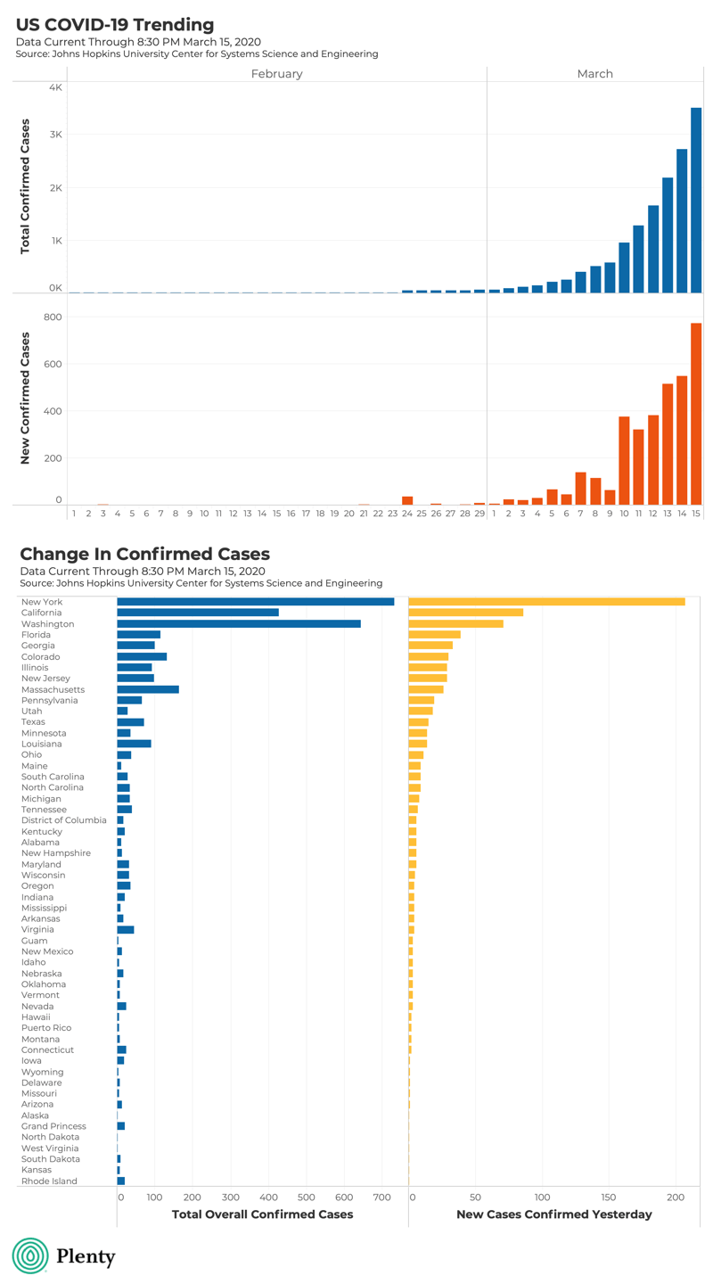
WHAT DOES THE TOP GRAPH SHOW?
The bar graphs are shown by date, one bar for each day in February and March. Note that the scale (vertical) axis of each graph is different.
The top graph, in blue, shows the total cumulative confirmed cases in the U.S. As of Sunday evening, it was about 3,500 cases. Each individual bar builds on the bar from the day before.
The middle graph, in orange, shows the new cases diagnosed each day. On Sunday, about 775 cases were diagnosed, which is way up from the previous days. Each individual orange bar is unique. In other words, if you add up all the orange bars shown, you get the same as the most recent (highest) blue bar.
The increase in the blue bar means, as you know, that overall confirmed cases in the US continue to grow. The increase in the orange bar means that the rate of change continues to increase. We have described it like this: the Coronavirus car is accelerating. The increase in the rate of change (the orange bar) is why everyone has been asked to stay home. (For more help interpreting these two graphs, please see our post this weekend, which you can find and share here.)
WHERE DOES THE DATA COME FROM?
The data is pulled from the GitHub repository of the Johns Hopkins Coronavirus Resource Center, which in turn is pulling from worldwide agencies. The data was updated this morning and shows cases through about 8:30 PM yesterday.
HOW ACCURATE IS THE DATA?
It is really important to note a few things. One, we already know this data is out-of-date. The numbers are higher than what is shown here. This also illustrates one of the problems in tracking COVID-19 – the data is changing rapidly, and many agencies are tracking it differently. There are lags and differences in when local and state agencies report their data, and when the database is updated. There are already significantly more cases than are shown here.
Also, as many have pointed out, confirmed cases relate to tests given. You probably know that there have been issues getting tests in the field. As more tests are given, we can expect both bars to grow as more cases are confirmed. To say it again: please keep in mind that the increase in confirmed cases is directly related to how much testing is being done. So we may be seeing simply a representation of testing coverage – we don't know and will need to keep looking at data to verify.
Finally, remember that "confirmed cases" does not mean "total cases." There are many more total cases than confirmed cases – unfortunately this ratio hasn't been verified, yet.
WHAT IS THE BOTTOM GRAPH?
The bottom graph shows cases by state. The blue bars show total confirmed cases by state. In other words, if you added up all of the blue bars in the bottom graph, you'd get the same as the most recent (highest) blue bar in the top graph. (Roughly; there are some small data discrepancies.)
The yellow bars show new confirmed cases in the state YESTERDAY (Sunday). In other words, the yellow bars show you where the confirmed cases are growing the most. The bottom graph, importantly, is sorted by these yellow bars.
This tells you where the number of confirmed cases is growing most. New York is at the top, which makes sense given the number of people who live there and the amount of testing being done, particularly around New Rochelle. California and Washington, where a number of the original cases started, are also near the top.
SO WHAT?
You have heard the "So What" 40,000 times by now. Be smart, stay safe, and don't travel unless you really need to. The pictures coming from airports this weekend were pretty terrible, unless you happen to like standing in lines of 1,000 people for six hours!
Also, just because "you don't know anyone who has been to China" or "you don't know anyone who is sick" doesn't mean that this doesn't apply to you. Please remember that the phrase "going viral" didn't originate with social media! It describes the rapid proliferation of illness. For a good metaphor about this, see this piece in the Washington Post. It explains in easy-to-understand terms how rapidly things can proliferate if the rate of change is increasing.
Be prepared for the number of confirmed cases is going to increase significantly in the next few days. The restrictions on gatherings and the closure of public places could extend for some time. It is vital that you get prepared now so that your next few weeks are as smooth as possible.
WHAT'S NEXT?
We're here for you, and we know that though there may be a few hard times ahead, we're also going to see incredible reminders of the power of the soul and the strength of the human spirit all around us.
We'll keep updating things and please reach out with comments and questions. The easiest way is to comment below or email us at hello@plentyconsulting.com.
We are sending care, love, light, and peace to you.
No Comments Yet
Let us know what you think