Four Behavioral Psychology Lessons For Nonprofit Web Design
Think about the last time you spent money online. Maybe you were buying a new swimsuit, or you found a book on Amazon that looked intriguing, or maybe you donated to a friend’s fundraising campaign so that she could run a marathon for her favorite charity. Was your purchase impulsive or pre-planned? How did you decide to spend that particular amount of money? What factors were important to you in making your decision?
We talked about choices in our e-book "The Participant Gears: Understanding Why People Participate in Peer-to-Peer", and discussed the three different factors that influence people to participate in a peer-to-peer fundraising program. But let’s take a deeper look at some of the behavioral principles surrounding how your audience makes choices online, so that you can apply these principles in a way that helps you and your constituents make a greater difference in the world.
Four Behavioral Psychology Lessons For Nonprofit Web Design
We often don't realize it, but elements of behavioral psychology and "choice architecture" are constantly informing the choices we make, from the displays at the supermarket to the color of the "Purchase Now!" button on a website. The White House even has a "Nudge Unit," modeled after the UK's Behavioral Insights Team, with the goal of using simple social experiments to accomplish everything from lowering energy consumption to increasing tax collection.
These days, however, choice architecture is more likely to be used by ecommerce companies than nonprofits or government agencies. Using well-chosen defaults, social norming, anchoring, and other tactics, ecommerce companies consistently guide consumers towards their desired purchasing decisions.
As someone focused on fundraising, understanding the principles behind behavioral psychology can help you design your website so that your constituents make the choice you want them to make. Here are four principles of behavioral psychology that you can use on your website to "nudge" your visitors towards your desired conversion.
Anchoring
Your audience doesn't always know how much time or money they should invest when it comes to donating and fundraising, and when this happens, they inevitably (and subconsciously) turn to context clues to help them make their decision.
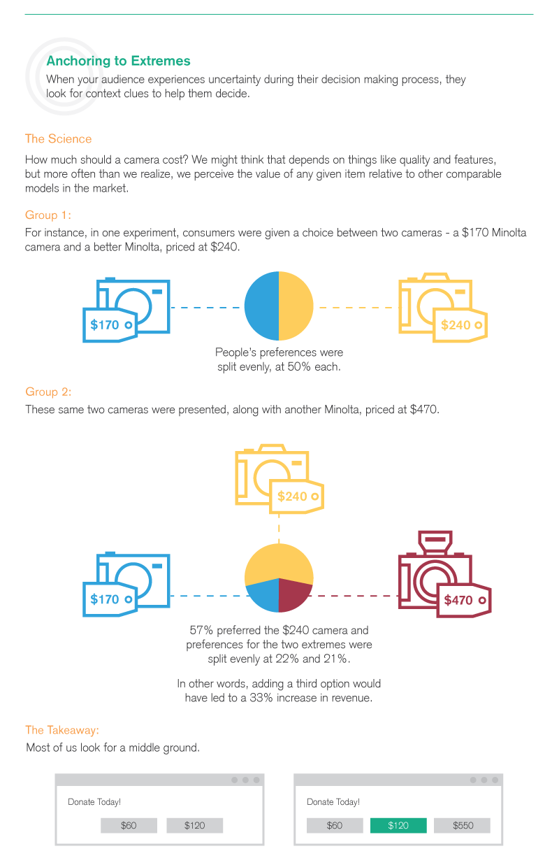
In one experiment on anchoring, consumers were given a choice between a $170 camera and a $240 camera; preferences were evenly split between the two. However, when a $470 camera was thrown into the mix, the majority (57%) then preferred the $240 camera, while the two extremes were equally chosen. The point is that by providing the right options to your audience you can strategically impact their decision-making. In this case, the addition of the third camera option would have led to a 33% increase in profits for the company.
For a fundraising program, the clearest application of anchoring is simple: add an "extreme" at the top end of your fundraising program. And while you're tinkering with your numbers, consider that research shows that using 'precise' numbers in anchors generally results in a better outcome. For example, instead of offering donation options of $50 and $100, you should experiment with suggested donations of $57, $125, and a top-end anchor of $559. (Ideally, those numbers will be rooted in an aspect of your mission and will have some relevance to what you do.) In our work at Plenty we often tinker with donation pages in this way. Your constituents might not feel comfortable making the highest suggested donation, and may not want to look ungenerous by choosing the lowest option, so by adding a higher extreme you can make the middle option more attractive by comparison.
Social Herding
Although most of us prefer to think of ourselves as totally independent when it comes to our decision-making, we’re often far more tribal than we realize, finding others with similar beliefs and values and assimilating ourselves into their group.
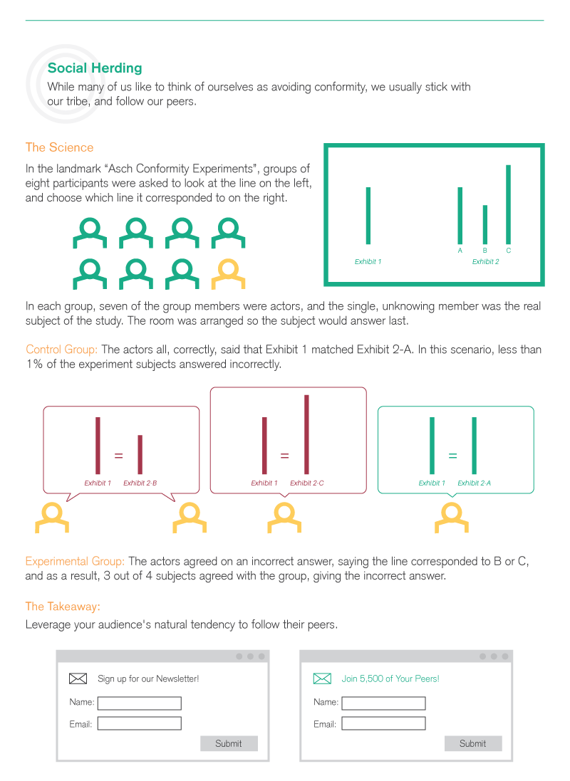
The Asch Conformity Experiments proved this beyond a doubt. Participants were asked to compare the lengths of different lines; unbeknownst to the research subject, the seven other "participants" in the group were actors told to respond with a specific answer. In the control group, the actors all answered the question correctly, and less than 1% of the experimental subjects answered incorrectly. In the experimental group, however, the actors purposely agreed on an incorrect answer, and as a result, three of our four subjects agreed with the group and chose the incorrect answer as well. Essentially, when given the choice between being a part of a tribe or giving the correct answer, people chose the tribe nearly every time.
What does this mean for a nonprofit website? You can design your website to use a sense of community to your advantage. For example, Mothers Against Drunk Driving (MADD) created an infographic highlighting that 3 out of 4 teens do NOT drink alcohol. This statistic frames the narrative in a way that puts teens that do not drink in the majority, in the hopes their peers will follow and assimilate to the larger group.
Similarly, a nonprofit website can use this inherent need to be a part of a tribe in creative ways, such as creating a banner that says "Join 21,000 others and subscribe to our newsletter." People want to be a part of a community, and they'll believe in the legitimacy of a cause if they see proof that other people similar to them support the cause as well.
Tyranny of Choice
We tend to believe that having more choices is a good thing - but as it turns out, having too many choices can hinder decisions and your success.
In one study on the effects of having more options, researchers set up a sampling table with a display of jams at a California grocery store, displaying 24 jam jars one day and six jam jars the next. The results: more people stopped for samples when 24 jars were displayed, but more people purchased the jams when there were only six samples out.
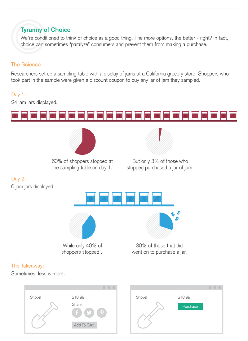
The takeaway for nonprofit websites: sometimes, less is more. For example, consider your website and the pages dedicated to requesting donations from visitors. Is the CTA to donate the primary focus of the page, or do you also have multiple social sharing buttons, a CTA to subscribe to your newsletter, and maybe even a CTA to register for an event on the page as well? If this sounds like your organization's site, you need to simplify the options you are giving your visitors so that they are not left feeling overwhelmed when deciding what action to take next. By cutting down on the decisions your fundraisers have to make, they're able to focus more on the action you want them to take.
Defaults
Sometimes thinking is hard. That's why your brain appreciates default choices – like ordering the same thing for lunch everyday at your usual place or opting to take the same route to work in the morning. Quite simply, routine or "default" choices are easier and quicker to make because you don't even have to think about them.
An interesting example of how using default choices can direct people to a desired outcome is the organ donation process in Europe. In this example, research shows that European countries where citizens are asked to opt-in to organ donation have significantly lower organ donation rates than similar countries that ask people to opt-out. The difference in organ donation rates isn't because the citizens of Denmark, Germany, and the United Kingdom don't care about the issue. Rather, the decision to donate one's organs is a weighty, emotional decision that isn't pleasant to think about and can leave people unsure of what to do. That's where default options come in! They make the decision for your audience!
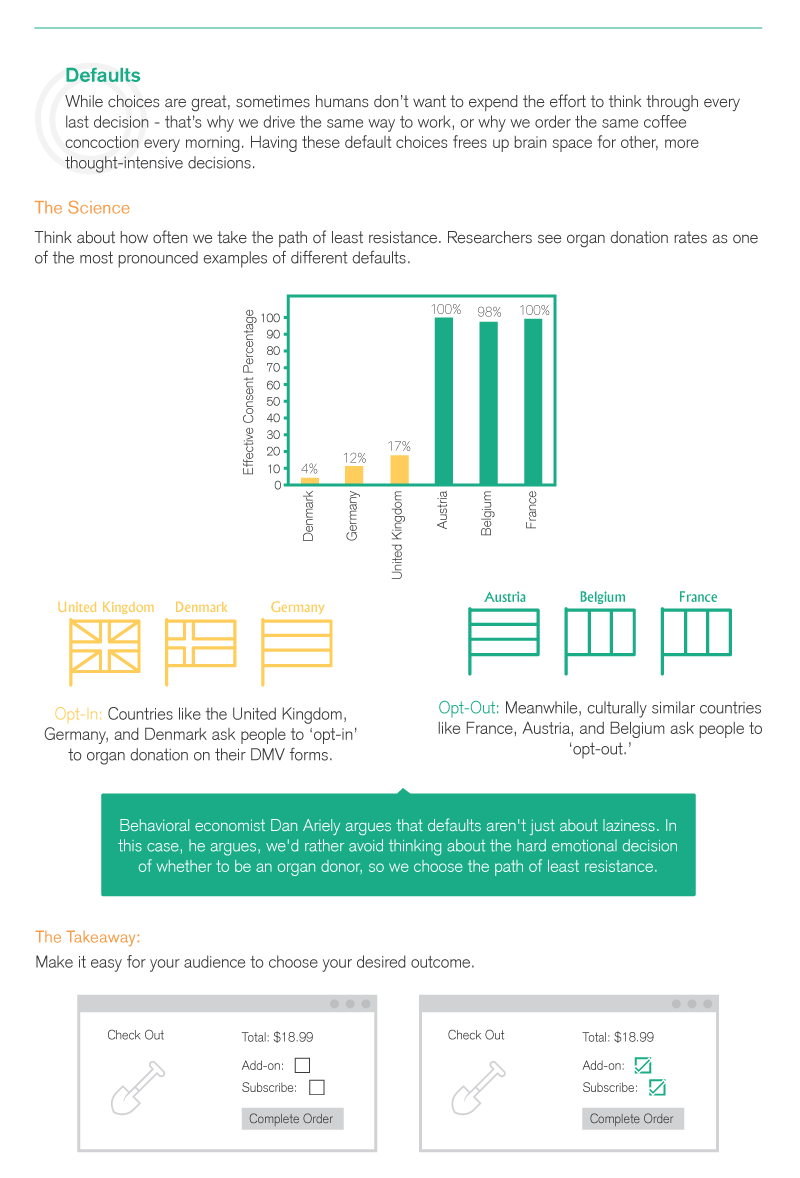
The great news is that nonprofits can capitalize on this behavior! Make it easier for people visiting your website to choose the preferred action by making it a default choice. For instance, if you want people to subscribe to your newsletter, instead of asking them to subscribe on the next form they fill out, have the subscribe box pre-checked. This will give them the option to opt-out if they would like, but will also make the decision to opt-in easier as it is already selected. Defaults are hard to resist, and by making the default choice the action you want your constituents to take, you can greatly increase your desired conversions.
You know what your goals are - why not make it as easy as possible for your constituents to help you reach them? By integrating anchors, herding, simplifying, and adding defaults to your nonprofit web design, you'll be able to optimize your site for the conversions you need to grow.
Share this
You May Also Like
These Related Stories
Four Reasons You Need A P2P Community

Lessons From The Private Sector: Peer-to-Peer Technology


No Comments Yet
Let us know what you think