

I was in a meeting the other day trying to figure out a particularly thorny issue. We had a group of smart, experienced, opinionated people in the room - my kind of meeting.
About halfway through the meeting, one of the participants produced a huge, multi-page Excel print-out. Many of the pages had colored graphs, three or four to a page. A second set of pages contained an assortment of tables correlating variables against one another. An accompanying narrative outlined that there was a "significant" relationship between some of the variables because the correlation coefficient was over .5.
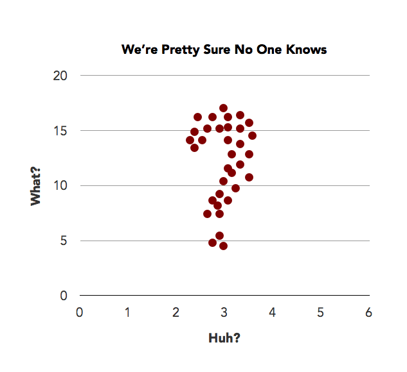 We all kind of sifted through the print-outs and gave them the old college try while the presenter tried to narrate. After a few minutes, it was clear that none of us, including the presenter, understood what the graphs meant. There was no description of the units or explanation of how they were derived. And so what happened was everyone started to use the graphs to explain their own point of view: "What I think they mean is..."
It was humorous, really, and luckily we all noticed it and started laughing and threw the spreadsheets aside. At the same time, the experience was a good reminder of how easy it is to manipulate - and be manipulated by - numbers.
A few tactical takeaways:
1. Label graphs clearly for your audience, not for yourself. Provide notes if the graphs aren't clear - but if the graphs aren't clear, rethink whether to use them at all.
2. Be careful of comparing correlations of a huge number of interconnected variables. In many systems (datasets), the variables are correlated with each other - that might be why you are studying them in the first place. So comparing a correlation of .5 to a correlation of .6 and calling the latter "better" is more than a tad sloppy, and isn't the whole story by a long shot. Variables interact. To study the interaction of a number of variables, look to regression analysis instead.
3. "Significance" means something very specific in statistics. It is not the same as "strongly correlated." When two things are correlated, it means they vary in relation to one another. That's it. A correlation does not answer any questions about the causes of the relationship. When a relationship is "significant," it means that there is a very low probability that the relationship has occurred by chance. Two variables could have a low correlation with high significance, or a high correlation with low significance.
Think of it this way: You might have a great night on the town with someone you hardly know; in the same way you might have a really lousy day with your closest friend. How well the date went is not the same as how close your relationship is.
Important Note: Significance will increase with the population size, so with large datasets you can find that all relationships are significant mathematically even if they have no practical significance at all!
4. Most of all, this hopefully goes without saying, but don't base decisions on a report that no one can understand!
The opportunity to collect and use data is within reach more than ever before, but with that reality comes responsibility. A responsibility to your organization and to your constituents to analyze it properly and objectively, and to report it clearly.
For more information on how to better incorporate data collection and analysis into your operations check out some of our other blog posts on these topics:
Share this

The Biggest Opportunity In Nonprofit Data

What's Hiding In Your Peer-to-Peer Data?
Comments (2)